Skillset
Modernising a global brand system across 20+ sites. Cox Automotive
Overview
One system to unify 20 brands without flattening their identity.
Cox Automotive is a global group made up of over 20 brands. The challenge was to bring them under one digital system that felt unified but still flexible. I was brought in to lead the visual direction and design a system that was sharper, clearer and more dynamic. That meant rethinking how their sites worked, felt and moved.
This included brands like Dealer Auction, Modix and Movex, each with different user needs, tones and goals. The aim was to bring visual and functional consistency across the ecosystem without losing what made each brand distinct.
The Challenge: Create a system that connects everything without losing clarity
The digital presence across the business had become fragmented. Different teams used different tools and rules. Components varied from site to site. Layouts felt inconsistent and dated. The goal was to build one scalable system that could support every site, simplify the experience for users, and feel sharp and modern across the board.


Involvement
The Approach: Less noise. More clarity. Smart movement
I led the digital exploration across the project, working with a UX designer, art director and motion designer from Great State. The design principles were simple: clarity, motion and accessibility. My focus was on creating a system that used interaction and movement with intent, introduced clear hierarchy, and followed a strong visual rhythm.
Some of the work included:
Choosing a Swiss-inspired typeface and grid system for structure and readability
Designing dynamic components that could flex across use cases and brand styles
Defining a visual language that could scale without breaking
Leading all parts of the design system including documentation, components, rules and interaction patterns
Working with motion to bring energy and focus to an otherwise static set of brands
Creating templates that helped teams across the business build faster and stay consistent
This wasn’t about locking every brand into a single look. It was about giving them a shared foundation to build from.

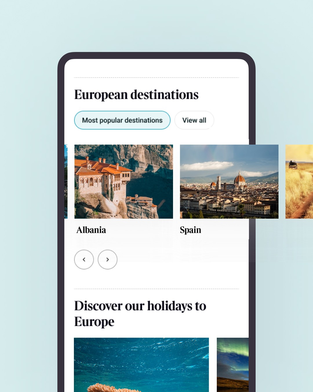
(↑) Ui exploration

(↑) Motion storyboarding


Conclusion
Stronger consistency. Sharper results
Rolled out across 20+ brands
23% uplift in user interaction
Reduced design debt across the platform
Silver Honour for a Shorty Award Best Website/app
Finalist in B2B at the CreativePool Awards
Positive feedback from internal teams and stakeholders across regions
The Reflection: Design systems are about trust
This was one of the most structured projects I’ve worked on. Every component, rule and layout had to hold up across brands and devices. I’m proud of how well the final system handled that complexity without losing clarity or motion. It brought calm to what was a pretty scattered landscape.
Other work
Interested in more?