Skillset
Designing digital for a 4x4 that didn’t exist yet. Ineos's Grenadier
Overview
Tough, honest, and built from scratch. On and off the screen.
INEOS Grenadier was a bold new entry into a crowded automotive market. No reputation, no brand awareness, and no physical product to show. Just a belief that there was space for a stripped-back, high-performance 4x4 built on utility. I joined the team to help translate that thinking into a digital experience. It had to earn trust, generate excitement, and feel as honest as the vehicle itself.
"A month after the website was ready to take pre-build orders, there was a 455% increase in website conversion to purchase. In the 12 months leading up to launch, site visits have increased 925% and time spent on the site has increased by 210%."
"When INEOS Automotive invited customers to make a vehicle reservation in September 2021, 75,000 site visitors registered an interest— and at one stage, 12 vehicles were being reserved every minute. The two-week reservation target was hit in the first 12 hours". — Sitecore
The Challenge: Designing trust before the car even existed.
This wasn’t just a website. It was the brand’s first impression. The goal was to make something people would believe in and rally behind before they could test drive or even see the car in person. That meant building a site that delivered real content, real clarity, and a tone that matched the no-nonsense spirit of the Grenadier.


Involvement
The Approach: Keep it bold. Keep it honest. Keep it useful.
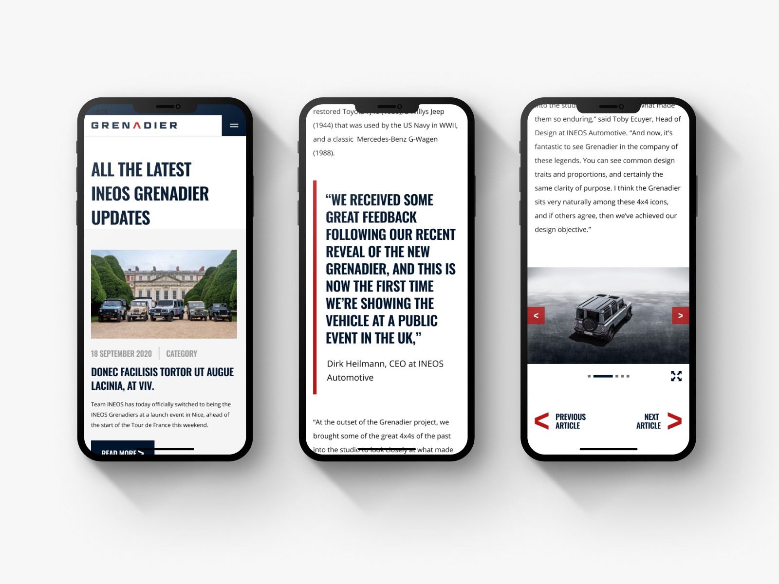
My approach followed the vehicle’s philosophy. Clean lines, strong utility, no fluff. Visually, I led the UI direction with a utilitarian design language: high contrast, bold type, large imagery, and intentional use of solid colour. I introduced iconography and layout systems inspired by the car’s in-vehicle interface. The brand’s chevron emblem became a subtle anchor within UI patterns.
We had no finished car to show, so I helped create a mini-series focused on individual components. Each part of the vehicle was introduced with specs, interviews with manufacturers, and detailed visuals. I took the idea from initial scamps to a full concept and used 3D assets to make it tangible on the page.
The Outcome: From zero to sold out in minutes
455 percent increase in site conversions
925 percent increase in traffic over 12 months
210 percent increase in average time spent on site
Over 75,000 reservations in the first 12 hours
12 vehicles reserved per minute at peak
The site created belief before the product existed and kept momentum strong once it launched.


Conclusion
The Reflection: Build trust through honesty, and people will come.
This was one of those projects where the site really was the showroom. We focused on clarity, storytelling, and restraint. Instead of over-designing, we let the message do the work. Transparency, bold visuals, and consistent UI gave people something they could trust.
Working without a finished product meant we had to think differently. The way our team collaborated across design, content, and development was key to staying aligned and building something cohesive. Looking back, I’m proud of the honesty we kept at the heart of the experience.
Other work
Interested in more?