Skillset
Creating a watchlist that felt secure, simple and right at home. Citibank.
Overview
Helping Citibank stay sharp in a market moving fast
The Citibank trading experience was powerful but had a gap. It didn’t offer a Watchlist. Most modern platforms had one. We were starting from nothing, but it needed to feel like it had always been part of the product. My role (alongside my partner, Dan) was to design the Watchlist experience across mobile and web, keeping it focused and grounded in the kind of trust people expect from Citibank.
The Challenge: Designing something new that felt familiar
This wasn’t about updating or refining. We were creating a key trading feature from the beginning. It had to work on iOS, Android and Web. It needed to feel intuitive and clear without introducing unnecessary complexity. We also had to respect the strict requirements that come with working in finance. Everything needed to be considered, reliable and consistent.


Involvement
The Approach: Make it natural to use and easy to trust
My focus was on the structure, interactions and overall clarity of the Watchlist. I worked closely with researchers, developers and design system leads throughout the process.
Here are the key things I worked on:
Designed the Watchlist experience from a blank state to a working interface
Mapped out key user flows including add, remove, reorder and update
Ensured each platform followed its native patterns so nothing felt out of place
Improved visual hierarchy, tap targets and confirmation steps to prevent mistakes
Used contextual data and layout to reduce friction and surface the right details at the right time
Helped extend the design system by creating new trading components and improving existing ones
I also worked on simplifying designs that felt too dense or fragile, keeping the interface flexible enough for future features without overwhelming users today.
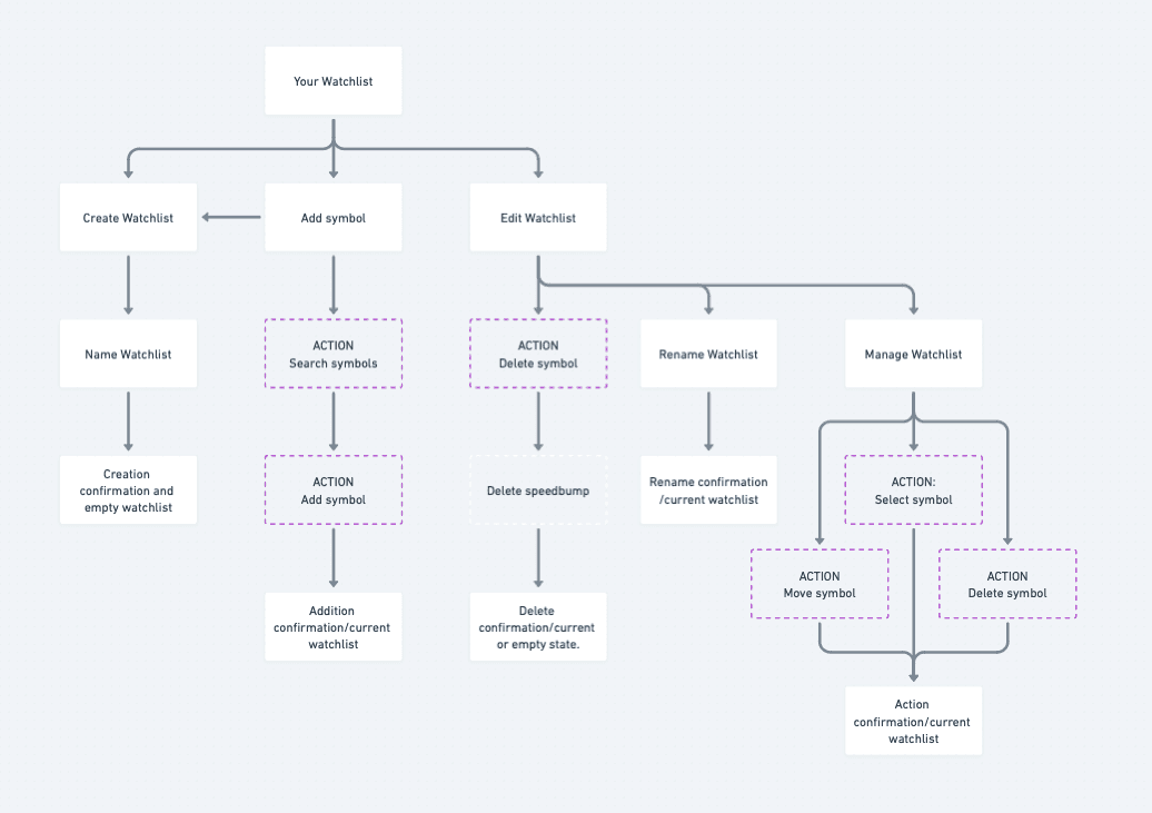
(↑) watchlist iA
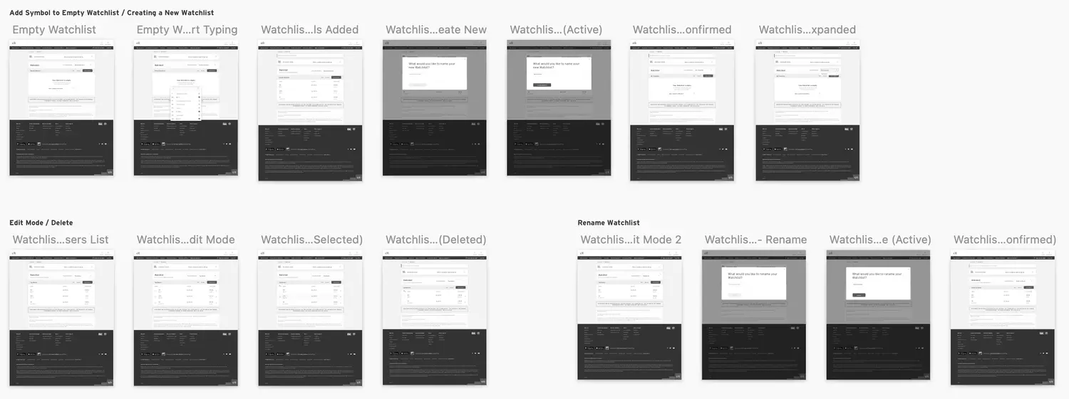
(↑) Some flows (web)


Conclusion
The Outcome: A Watchlist that felt part of the platform, not bolted on
Users could track stocks in a way that felt calm and reliable. The new feature didn’t need to be explained. It just worked. Feedback showed that the flow felt easy to understand and trustworthy. The design system gained more flexibility, and the product team had a better foundation to grow the trading experience across platforms.
The Reflection: Sometimes the best feedback is silence
When a feature works so smoothly that no one questions it, that’s often a sign of good design. This project reminded me that thoughtful layout, platform respect and visual clarity can go a long way. Especially when people are trading with real money.
Other work
Interested in more?