Skillset
Designing for clarity in the middle of climate complexity. COP28's Dubai, UAE
Overview
Designing a platform that helps people understand and engage with climate action.
COP28 was big. Not just in scale but in ambition. The aim was to help people understand what was happening, how it related to them, and where to go next. It was also about the practical stuff. Finding events that mattered to you. Saving them. Sharing them. Reading about guest speakers. Navigating the venue. Finding food. Talking to people who cared about the same things. Hosting and attending live sessions and understanding how it all connected.
I was brought in to lead the design system across mobile and web, later focusing solely on web. The goal was to bring structure to a fast-moving, content-heavy event and make it feel simple, useful and human.
The Challenge: Build an experience that makes climate action easier to follow and easier to join
This wasn’t a brochure site. It had to work in real time for people on the ground, often on their phones, with a wide range of needs. That meant designing tools for wayfinding, scheduling, video, chat, speaker profiles and news updates, all in one place. It also had to serve a global audience with different expectations and levels of knowledge.
The experience needed to feel confident and official, but still open and approachable. And the timeline was short. We had just eight weeks.


Involvement
The Approach: Clarity first. Then connection.
I led the visual direction exploration, under the Creative Director, and development of release 0 - 4 across both the app and the website. This included setting the type system, colour palette, spacing, layout rules, components and iconography. The mobile design system was created from the ground up. As the team grew for release 5, my focus became web, which I worked within an existing structure but established a visual language that felt aligned and intentional across platforms.
Some of the features I worked on included:
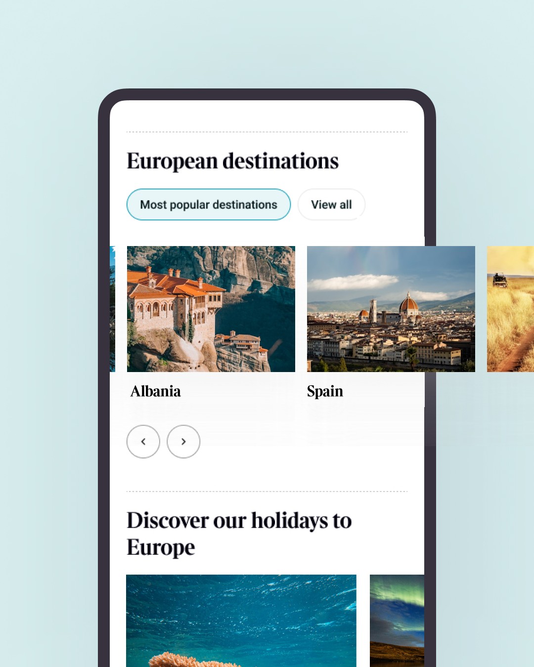
Tools for finding and saving sessions, with filters, search and location info
Speaker pages with bios, talk times and related content
Session pages with live video, sharing options and contextual info
Chat features to connect people with similar interests
Infographics and short explainers that simplified policy content
A layout system that supported both quick scans and deeper reads
Everything was designed with mobile use in mind. People needed to get in, find what they needed, and move on without friction.
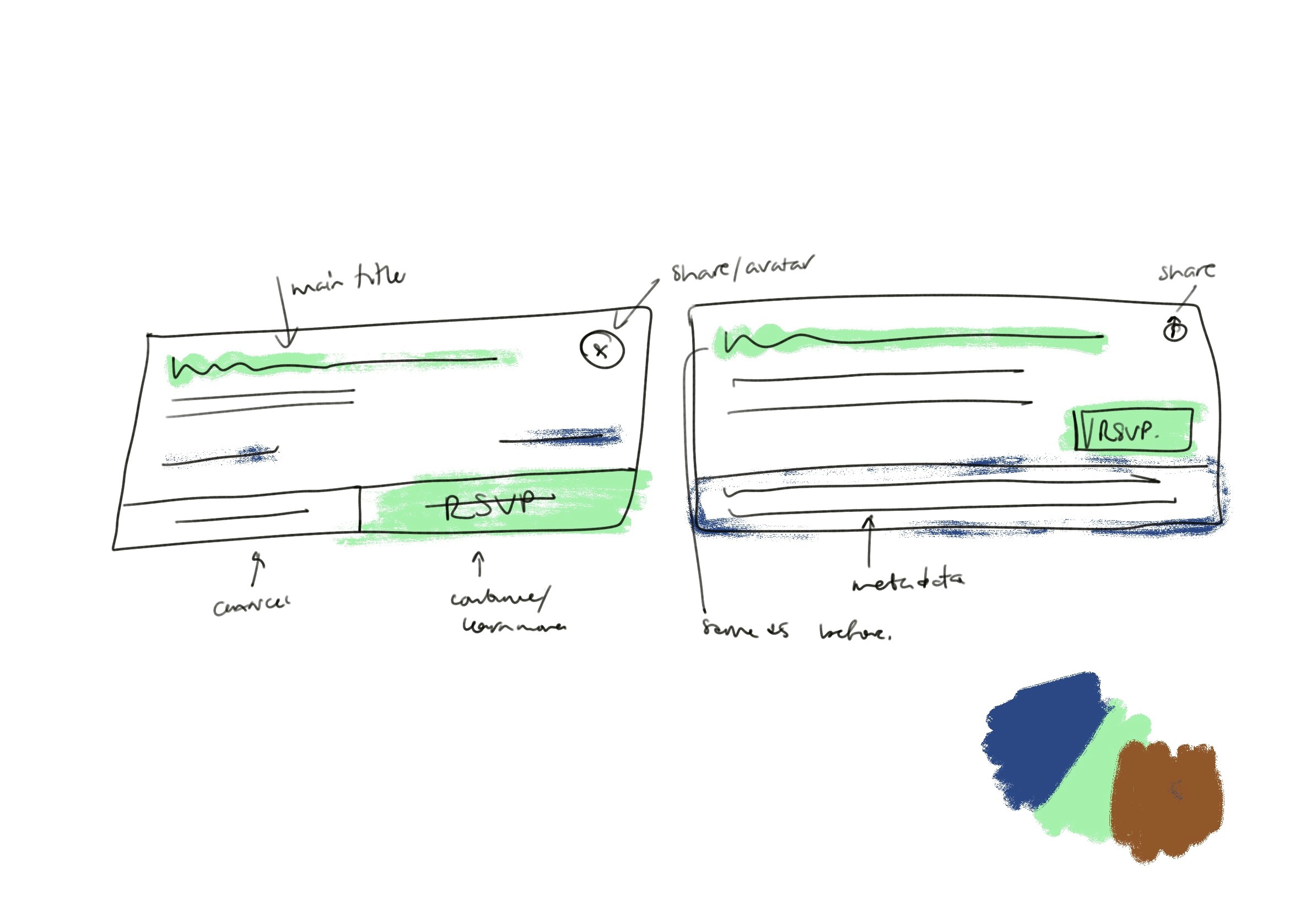
(↑) Ui explration
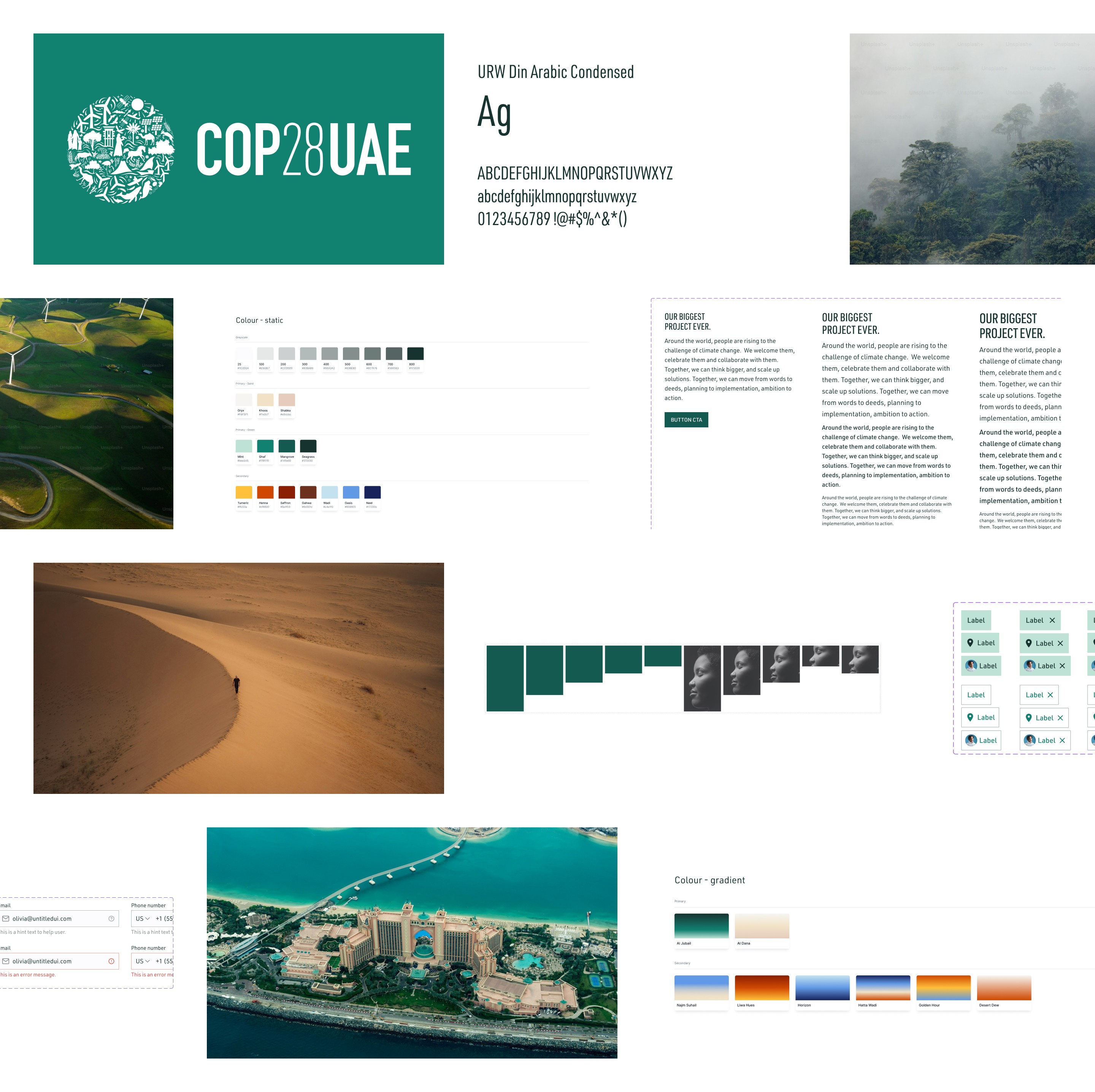
(↑) Snippet of design system


Conclusion
The Outcome: A simple, focused experience that reached people where they were
Over 57,000 people downloaded the app. 3 million web page views. The content was accessible, clear and easy to navigate. The platform helped improve understanding of climate topics while supporting the practical needs of people attending or following the event. It also marked a step in the direction I want to keep moving — projects that support economic or social impact.
The Reflection: Design should guide, not overwhelm
This project was about structure, tone and restraint. The subject was heavy, but the interface didn’t need to be. I’m proud of the clarity we brought to a fast-moving event, and how well the visual system held together across platforms. There’s more I’d explore with time, but for eight weeks, this was solid, intentional work that mattered.
Other work
Interested in more?