Skillset
Turning blog readers into buyers with small, strategic changes. Butternut Box
Overview
Butternut Box is a fresh dog food subscription company with a strong personality and loyal customer base. I was brought in to improve two key parts of the experience — the blog and the checkout — with the aim of increasing conversions and making the user journey more intuitive.
The challenge wasn’t about reinventing everything. It was about finding the right touchpoints, understanding how people were using these parts of the site, and making the smallest possible changes that could have the biggest impact.
The Challenge: Meet users where they are, and make it easier for them to say yes
The blog had strong SEO and pulled in high traffic, but the drop-off between reading and buying was too steep. On the checkout side, friction points like slow load times, too many steps, and limited payment options were affecting completion.
The goal was to tighten the journey. Turn more blog readers into subscribers. Make checkout feel smooth and quick without losing trust.


Involvement
The Approach: Conversion-focused design without losing character

(↑) Exploring ideas
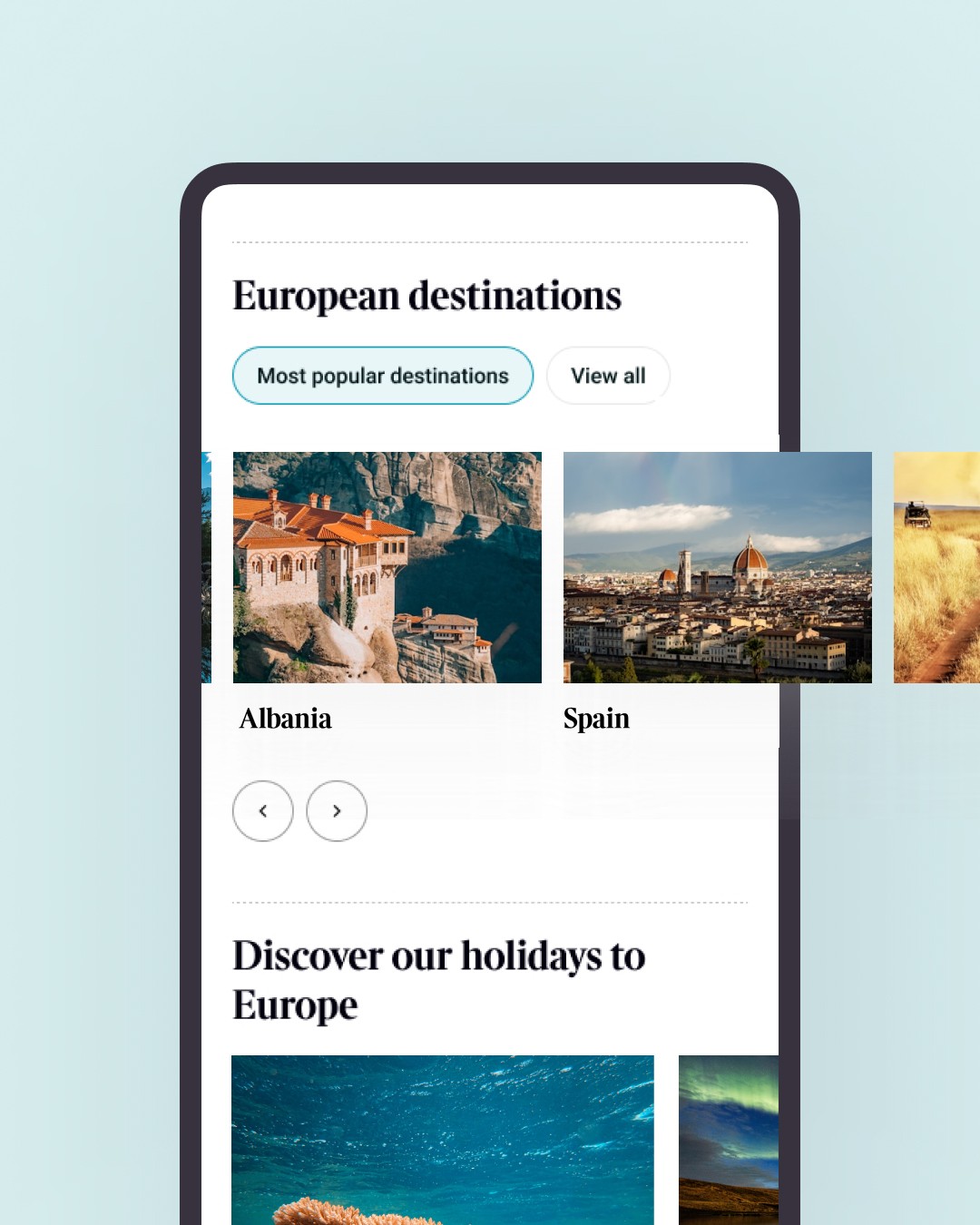
For the blog:
Introduced a pricing teaser component that gave readers a clearer next step
Designed this to sit within articles and guide users into the sales funnel
Mapped entry points and aligned content flow with key selling moments
Used data to simplify layout and structure for better readability
For checkout:
Introduced Apple Pay and Google Pay as express payment options
Kept guest checkout, but made it easier to spot and complete
Added auto-fill for returning users to reduce drop-off
Brought checkout down to fewer screens with less cognitive load
Used clearer microcopy and progress indicators to guide the flow
Both parts of the project followed the same principles. Reduce friction. Respect user intent. Let the brand personality come through in subtle ways.

(↑) Exploring ideas


Conclusion
The Outcome: Small changes that made a measurable difference
22% increase in blog-to-sale conversions over one month
Better checkout completion with fewer abandonment points
Streamlined UI that aligned with an evolving design system
A more joined-up journey from content to conversion
The Reflection: Strategic design thinking is where the real lift happens
This wasn’t about flashy visuals or big rebrands. It was about knowing where to look, asking the right questions, and making design choices that worked harder. I’m proud of how lean and thoughtful the work was, and how it delivered real results.
Other work
Interested in more?